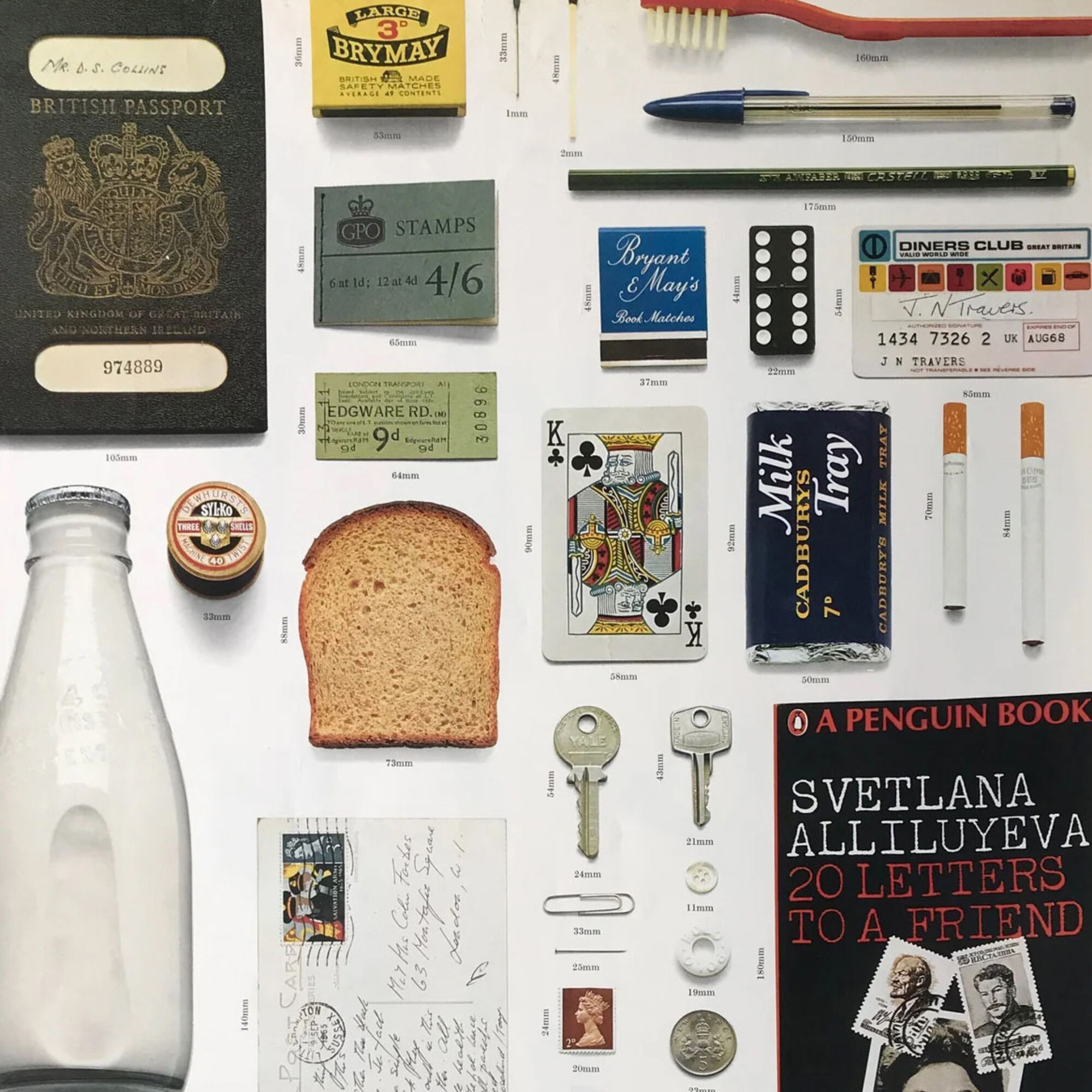
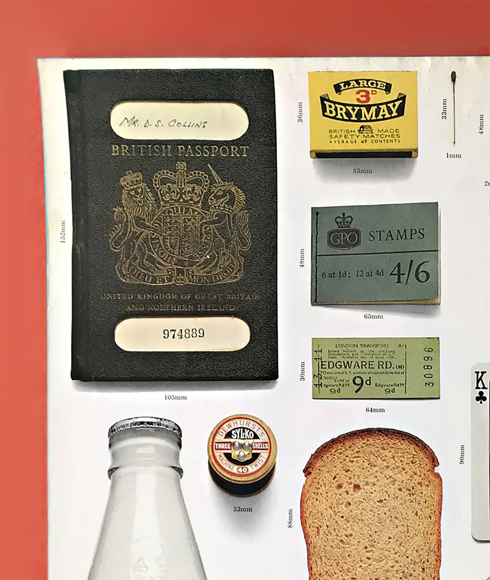
In 1968, the design firm Crosby/Fletcher/Forbes was commissioned to work on a series of posters entitled ‘Think Metric’ introducing the metric system to the UK. To help navigate this significant shift they approached the brief through referencing the familiar.
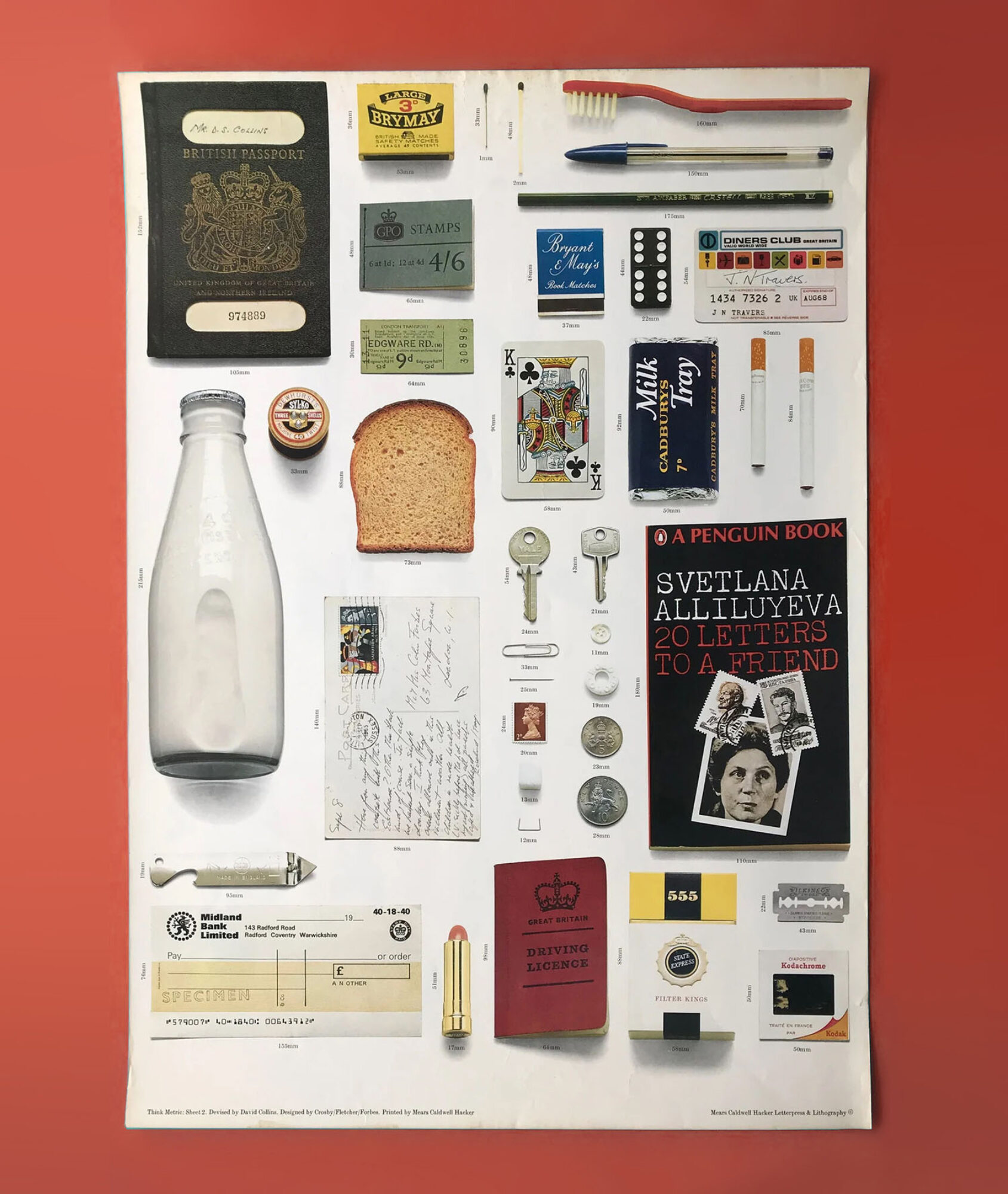
Under Harold Wilson’s progressive Labour Government, the 1960s was a time for social change and structural renewal designed to equip Britain for a technological ‘future’. Along with the introduction of decimalisation and Tony Benn’s reforms as Postmaster General, the antiquated imperial system of measurement would be consigned to the past. The influential design practice of Cosby/Fletcher/Forbes (later to become the nucleus of the international firm Pentagram) had mirrored this progressive and modern vision for the UK through their own modernist take on visual communication. Historic artist-led methods of communication were making way for a more graphic approach. All the Think Metric posters demonstrate this fledgling sensibility, but the most visually striking example in the series is the ‘Common Objects’ poster. The poster’s concept is simple; seemingly the designer – unnamed, but the style appears very reminiscent of Colin Forbes’ work – took a look around their London mews studio, gathered together day-to-day items – recognisable to anyone in late-1960s Britain – and took a photo. There’s nothing remarkable about any of them.
Almost 60 years later, when we examine these objects today, they mostly seem to conform to the contents of a 1960s middle-class, predominantly male environment. It is certainly a snapshot in time; nostalgic to some (pints of milk) or baffling to others (35mm slides). Yet perhaps what is of most interest are the objects that are now obsolete or on their way out. A number of these once common items are becoming digital at varying rates of speed. Like all innovation, this progress is designed to simplify our lives, but it is worth considering what impact the loss of physical objects of communication might have on society.
The long-established way in which we interact with objects of information-led communication is rapidly changing. Many ubiquitous objects that provide specific types of information – each with a unique physical form and cultural context (think newspapers, train tickets, books, banking ephemera) – are migrating to one multi-functional form of digital object (i.e. smart phone, tablet). Because these devices are used for reading, playing games, paying bills, communicating with friends – all unconnected but within the same physical form – the material culture of the object itself is left undetermined. Laptops, tablets and smartphones supply our brains with mixed messages about what the object’s actual role is. This leads to a distinct lack of informed physical cues beyond the literal message.
We evolved to explore our surroundings. It is how we build knowledge. This tacit approach to meaning-making is a continual full body experience filled with sights, sounds, smells, tastes, textures and beyond. From birth, these multiple sensations provide us with information about the things we interact with, and in turn, provide us with information about ourselves. Do we like that taste? Is that item nice to touch? The information contained in these experiences is retained in our long-term memory as ‘schemas’ which we unconsciously recall when we encounter similar experiences. We come to understand an object through the sensory experience of it, our retained knowledge of that encounter, how it relates to previous experience, and its social and cultural context. This means that we can look at the texture of something and know how it will feel or hear something and recognise what is making the sound without needing to see it.
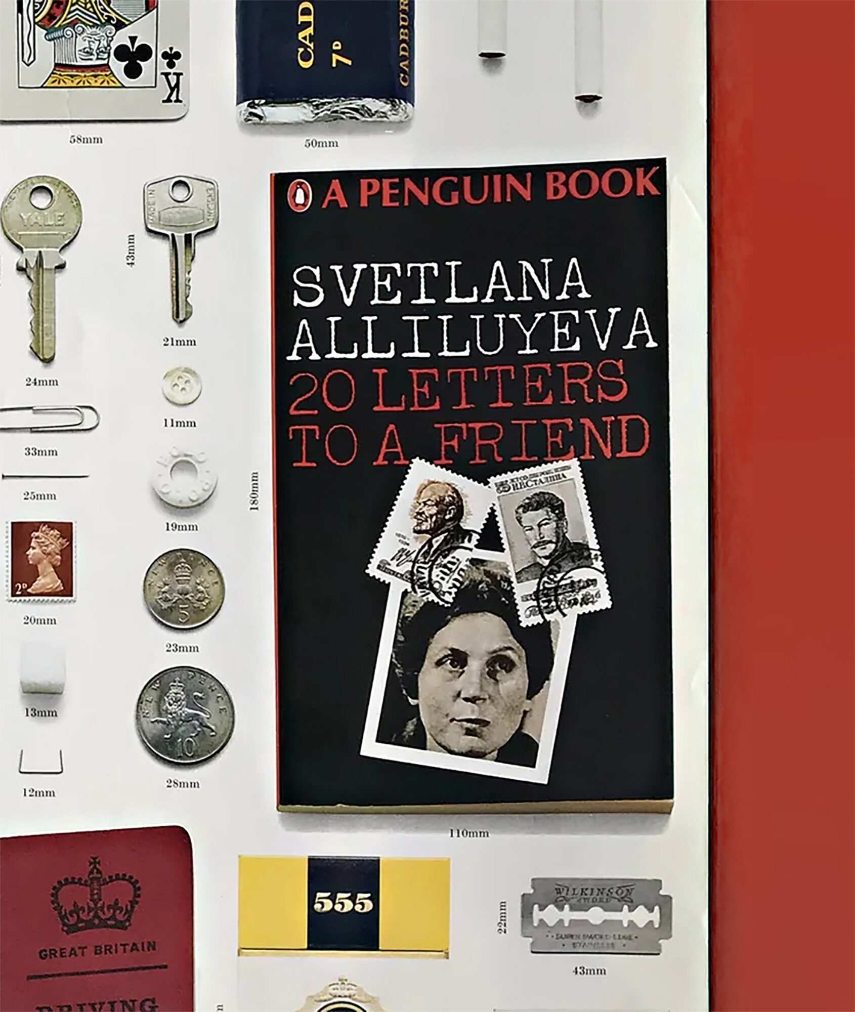
The Penguin book in the Think Metric poster is a good example of this. Even though we perceive it as essentially uni-sensory (in terms of appearing to only engage us visually through the text) it provides a wealth of extra information. The paper and shape of the book form has come to represent solitude and contemplation – perhaps a chapter will be read just before bed or on the way to work. The cover also provides context on the ‘source’ of the information. Is the book professionally produced? Is the publisher respected and established? This then provides further context on whether the ‘editing’ of the material is seen as reliable and thorough – this includes the interpretation derived from where the book is stocked.
As a form of sensory ‘language’, the materials that make up an object and the context in which they appear are important. And then there’s metaphor. This culturally informed knowledge borrows the associated feelings and beliefs attached to materials, forms and contexts and then uses them in new objects. Through shared culture, we understand what the shape and form of an item signifies and the emotional connections it holds. Designers often play with these associations to strengthen meaning-making; if we lose the physical form, we lose the opportunity for metaphor. The forms themselves also come to have power beyond their intended purpose. Take the classic blue British passport in the poster. A contentious object that became the unlikely centre of attention during Brexit. For many, it signified a loss of sovereignty, for others a period of out-dated empire. After a period away, its return is not insignificant.
Like certain objects in the Think Metric poster, some things are possibly too important to lose. Will physical currency become obsolete or is what that loss might represent too big culturally and psychologically? Ultimately, whether it’s the design perfection of a paper clip or Cadbury’s Milk Tray purple, certain things endure. Perhaps ironically, the metric system never fully caught on in the UK and pints and miles still have their place. As more physical items with unique forms and contexts move to a new digital home it is worth reflecting on how we make sense of the world and what permanence means. Being of the world gives us agency over it and helps us to understand more about ourselves.